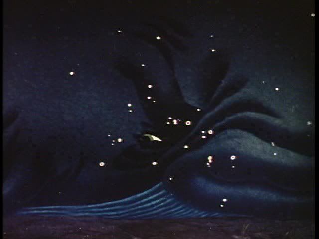
THE JUNGLE BOOK- Comparison pics
Oh ok that makes sense, but there probably wouldn't have been one of those shadows under Mowgli when he is lying on Baloo. Do you think that those shadows would have been wanted by the art directors, or would they have tried to not have them not in there. After this discussion I rewatched the Jungle Book and noticed that there are no floor shadows under the character. The animators did such good jobs and grounding the characters that I never noticed after all of these years. I noticed it also on clips on Cinderella but there are shadows on the clip I saw on Snow White. The are floor shadows painted on the cel right?
Yes.drsd2kill wrote:The way the cels are lit and photographed can create darker areas of the frame - or shadows - on what is otherwise a solid patch of the same color. This is lost when they recreate these films and digitally recolor them.
And therefore a face like Belle's or Cinderella's has never been 1 big paint patch of 1 colour, but different shades of pink, lighter area's, darker parts, red glow on the cheeks, little shadows, that's all gone.
Look at the belly of Baloo. The difference between the 1997 laserdisc and the 2007 dvd is exactly what I mean.
Exactly, it's not about the shadows, but about numerous other details.drsd2kill wrote:Floor shadows are painted on, but that isn't what I was talking about.
The same thing happened here:
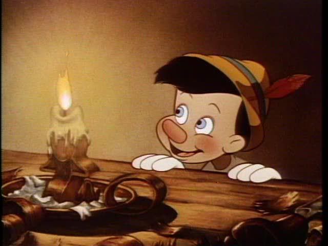
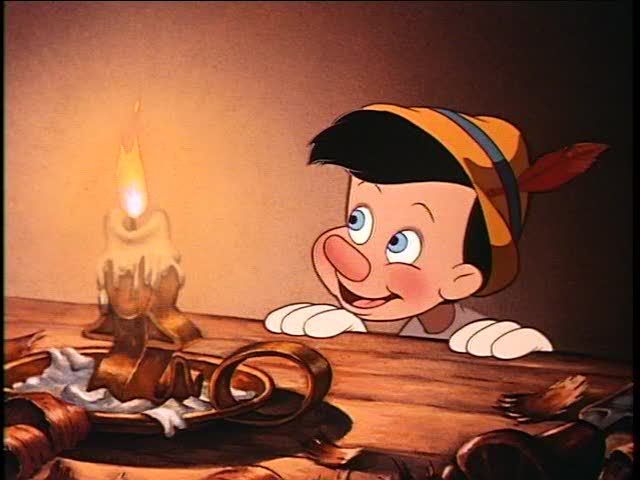
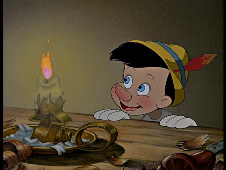
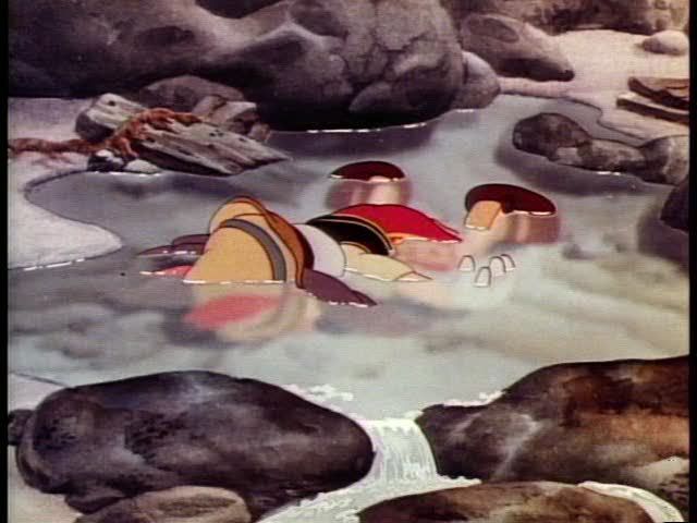
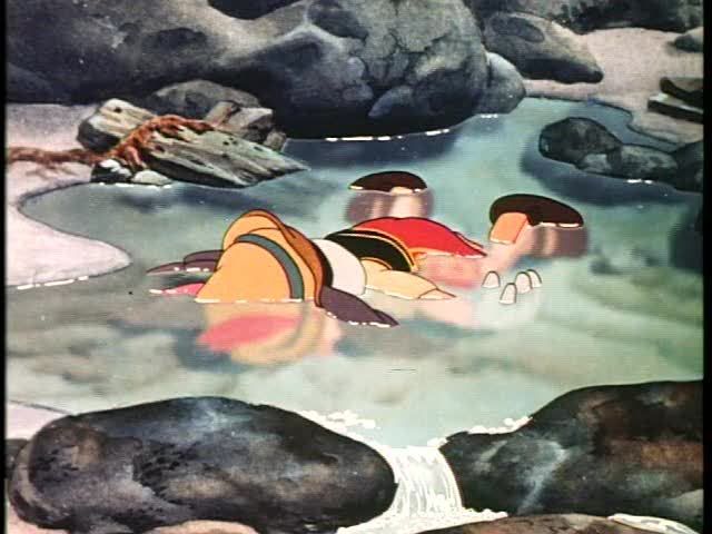
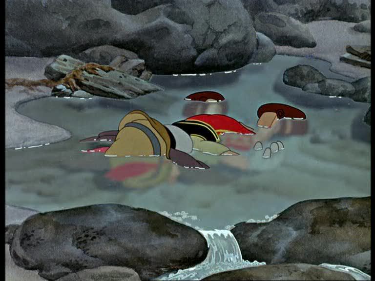
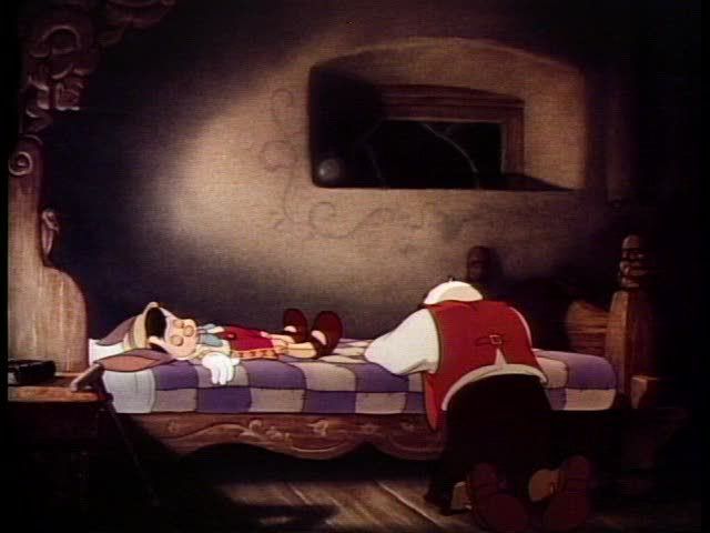
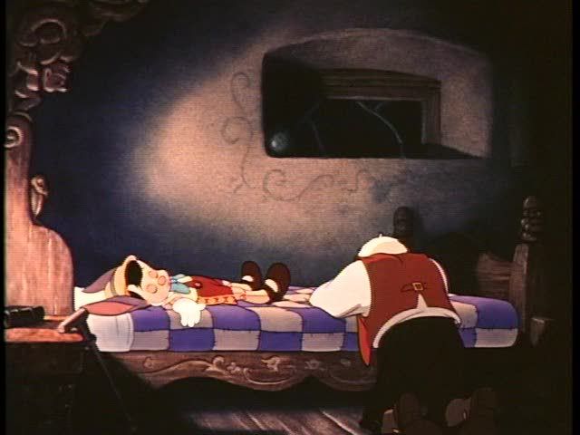
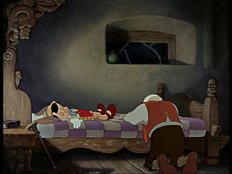
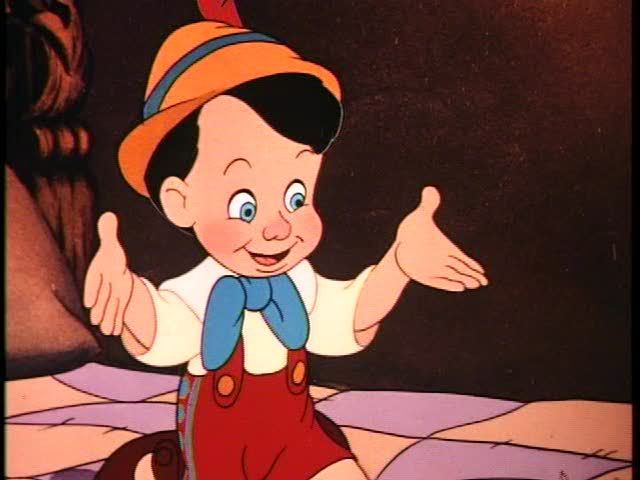
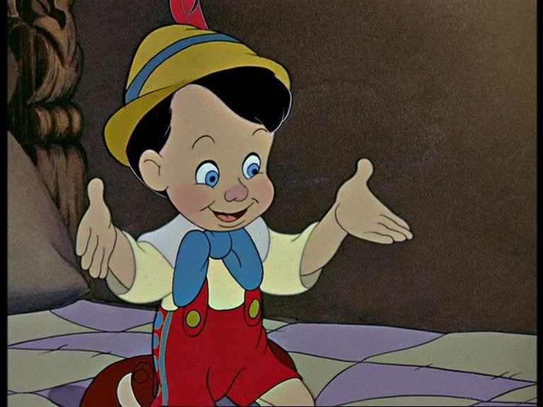
drsd2kill wrote:A = PINOCCHIO 1987 CAV Laserdisc [transfer used for 1985 VHS]
B = PINOCCHIO 1993 CAV Laserdisc [transfer used for 1999 DVD]
C = PINOCCHIO 2003 UK DVD [Lowry restoration released overseas but not in the US]
<a href="http://photobucket.com" target="_blank"><img src="http://i46.photobucket.com/albums/f112/ ... CHIO9A.jpg" border="0" alt="Photobucket - Video and Image Hosting"></a><BR>
<a href="http://photobucket.com" target="_blank"><img src="http://i46.photobucket.com/albums/f112/ ... CHIO9B.jpg" border="0" alt="Photobucket - Video and Image Hosting"></a><BR>
<a href="http://photobucket.com" target="_blank"><img src="http://i46.photobucket.com/albums/f112/ ... CHIO9C.jpg" border="0" alt="Photobucket - Video and Image Hosting"></a><BR>
<a href="http://photobucket.com" target="_blank"><img src="http://i46.photobucket.com/albums/f112/ ... HIO10A.jpg" border="0" alt="Photobucket - Video and Image Hosting"></a><BR>
<a href="http://photobucket.com" target="_blank"><img src="http://i46.photobucket.com/albums/f112/ ... HIO10B.jpg" border="0" alt="Photobucket - Video and Image Hosting"></a><BR>
<a href="http://photobucket.com" target="_blank"><img src="http://i46.photobucket.com/albums/f112/ ... HIO10C.jpg" border="0" alt="Photobucket - Video and Image Hosting"></a><BR>
<a href="http://photobucket.com" target="_blank"><img src="http://i46.photobucket.com/albums/f112/ ... HIO11A.jpg" border="0" alt="Photobucket - Video and Image Hosting"></a><BR>
<a href="http://photobucket.com" target="_blank"><img src="http://i46.photobucket.com/albums/f112/ ... HIO11B.jpg" border="0" alt="Photobucket - Video and Image Hosting"></a><BR>
<a href="http://photobucket.com" target="_blank"><img src="http://i46.photobucket.com/albums/f112/ ... HIO11C.jpg" border="0" alt="Photobucket - Video and Image Hosting"></a><BR>
<a href="http://photobucket.com" target="_blank"><img src="http://i46.photobucket.com/albums/f112/ ... HIO12A.jpg" border="0" alt="Photobucket - Video and Image Hosting"></a><BR>
<a href="http://photobucket.com" target="_blank"><img src="http://i46.photobucket.com/albums/f112/ ... HIO12B.jpg" border="0" alt="Photobucket - Video and Image Hosting"></a><BR>
<a href="http://photobucket.com" target="_blank"><img src="http://i46.photobucket.com/albums/f112/ ... HIO12C.jpg" border="0" alt="Photobucket - Video and Image Hosting"></a><BR>
<a href="http://photobucket.com" target="_blank"><img src="http://i46.photobucket.com/albums/f112/ ... HIO13A.jpg" border="0" alt="Photobucket - Video and Image Hosting"></a><BR>
<a href="http://photobucket.com" target="_blank"><img src="http://i46.photobucket.com/albums/f112/ ... HIO13B.jpg" border="0" alt="Photobucket - Video and Image Hosting"></a><BR>
<a href="http://photobucket.com" target="_blank"><img src="http://i46.photobucket.com/albums/f112/ ... HIO13C.jpg" border="0" alt="Photobucket - Video and Image Hosting"></a><BR>
<a href="http://photobucket.com" target="_blank"><img src="http://i46.photobucket.com/albums/f112/ ... HIO14A.jpg" border="0" alt="Photobucket - Video and Image Hosting"></a><BR>
<a href="http://photobucket.com" target="_blank"><img src="http://i46.photobucket.com/albums/f112/ ... HIO14B.jpg" border="0" alt="Photobucket - Video and Image Hosting"></a><BR>
<a href="http://photobucket.com" target="_blank"><img src="http://i46.photobucket.com/albums/f112/ ... HIO14C.jpg" border="0" alt="Photobucket - Video and Image Hosting"></a><BR>
<a href="http://photobucket.com" target="_blank"><img src="http://i46.photobucket.com/albums/f112/ ... HIO15A.jpg" border="0" alt="Photobucket - Video and Image Hosting"></a><BR>
<a href="http://photobucket.com" target="_blank"><img src="http://i46.photobucket.com/albums/f112/ ... HIO15B.jpg" border="0" alt="Photobucket - Video and Image Hosting"></a><BR>
<a href="http://photobucket.com" target="_blank"><img src="http://i46.photobucket.com/albums/f112/ ... HIO15C.jpg" border="0" alt="Photobucket - Video and Image Hosting"></a><BR>
<a href="http://photobucket.com" target="_blank"><img src="http://i46.photobucket.com/albums/f112/ ... HIO16A.jpg" border="0" alt="Photobucket - Video and Image Hosting"></a><BR>
<a href="http://photobucket.com" target="_blank"><img src="http://i46.photobucket.com/albums/f112/ ... HIO16B.jpg" border="0" alt="Photobucket - Video and Image Hosting"></a><BR>
<a href="http://photobucket.com" target="_blank"><img src="http://i46.photobucket.com/albums/f112/ ... HIO16C.jpg" border="0" alt="Photobucket - Video and Image Hosting"></a><BR>
Chuck
-
That1GuyPictures
- Gold Classic Collection
- Posts: 249
- Joined: Tue Aug 31, 2004 8:33 pm
I think that you guys don't get it.
When you compare a crappy 4-5th generation print that was transferred to Laserdisc, DVD or VHS, the colors are altered due to the mastering methods of the time.
If the same print used for the 1992 release was transferred to DVD right now, it would look different than the 1992 release without any cleanup because advances in film transfers have been astounding.
I think it's hilarious when people say "It doesn't look like my VHS, so the movie isn't like it was in the theater."
I saw Jungle Book in the theater, and remember it being extremely colorful.
The 1999 DVD is washed out, and suffered from a poor restoration that even effects the motion of the Video.
All that aside, look at the backgrounds in the still section on the DVD. They are extremely colorful.
And just look at the restoration...the film looks georgeous.
I think it's funny that most people are saying "I'm sure Walt Disney would roll over in his grave..." Yeah, he'd probably roll over and say "Oh my gosh, my film looks so clean and colorful! If we could have made it look like that back then, we would have!" How horrible!
And above all, it would be beneficial to realize that most people here are not film restoration experts. There are those who get paid to do such things...and if you want to gripe about film restoration...go get a job as one, and put your money where your mouth is.
If you don't like the restoration, too bad. I'm sure Disney will be using this print for QUITE some time now that they've shelled out the dough for it.
If you are angry stop posting and write a letter to Lowry Digital (DTS Images).
Disney doesn't do the restorations in house.
Someone is always going to be unhappy with everything.
Disney and Lowry did a great job on this film.
Okay... Let's take this one step at a time.That1GuyPictures wrote:I think that you guys don't get it.
When you compare a crappy 4-5th generation print that was transferred to Laserdisc, DVD or VHS, the colors are altered due to the mastering methods of the time.
If the same print used for the 1992 release was transferred to DVD right now, it would look different than the 1992 release without any cleanup because advances in film transfers have been astounding.
Someone is always going to be unhappy with everything.
Disney and Lowry did a great job on this film.
I don't know what element was used for PINOCCHIO's initial VHS and Laserdisc releases in 1985-1987 (the Laserdisc was reissued in CAV format in 1987), but I DO know that the 1993 VHS and Laserdisc releases (the same master used for the 1999 DVD and VHS reissues) was highly touted as "fully restored", and the book included with the CAV Laserdisc said that the restoration was made from the original 3-strip Technicolor negatives. The 2003 DVD released internationally - but not here - certainly is clean and all, but it is very flat as well. All subtleties in lighting and shadow are gone. That's why I made the screen comparisons to show this.
I don't know what was used for the 1992 or 1997/99 video releases of THE JUNGLE BOOK, but I highly doubt it was some 5th generation beat-up 16mm dupe - lol - Though I can't say the same for the earliest Laserdisc releases of DUMBO, ALICE IN WONDERLAND, or THE MANY ADVENTURS OF WINNIE THE POOH (to name a few - I'm in the process of making screen capture comparisons of those as well, and DUMBO and ALICE have been on video MANY times - trying to determine which used the same masters).
And for the previous poster - BEAUTY AND THE BEAST was entirely colored on Disney's CAPS system, so comparing Belle's face to Cinderella's hand-painted countenance isn't a fair comparison.
For the record, I thought CINDERELLA was the most off-looking of the Disney DVD restorations, followed by PETER PAN.
-
Jordan

- Gold Classic Collection
- Posts: 413
- Joined: Thu Sep 25, 2003 11:15 am
- Location: DisneyLand Paris
I've just posted this in the Pinnochio thread but it also applies here so... 
IMO, I think we should all be reminded of the following things on the changes of the restoration based on this screencaps before judging it:
1) The brighter colors that you can see on older transfers are not necessarily the intended ones, as in: the colors on the original cells. They appear brighter on screen, I think maybe because of the methods they used until digital technology. I saw recently a screencap of the latest very bright DVD version of the Aristocats (you know, shinny, "happy" too-lively colors) and next to it an original cell, and I can tell you that the DVD transfer was all wrong ! I think this will go away with the next Aristocats restoration. This is true for other Disney films before and after having being extensively restored for special edition releases. My point is this: the current digital restorations aim at being the closest to the original cells as possible and not reproduce the mistakes, or older "tones" or whatever you call it, of older transfers. So it's not because a newer transfer is different and not as bright as the older one that it's not the best, and the closest to what the animators have drawn.
2) Screencaps made on computer do not give justice to what you actualy see of a DVD in movement. You ain't really seen it until you've seen the real thing in movement, and we can't judge a picture and restoration only based on screencaps made by a software. We know it's been true for other Disney restorations.
And I own this 2003 edition and can tell you that the film looks better than ever, and just like I was saying, the too-bright and too-accentuated colors are gone and it looks really more natural. It's all better !
Brighter colors as you've redone it on this caps are good for promotional material such as poster or something like that (aimed at kids primarly; it's the role of bright and shinny colors...) but not for the film itself ! It might look good on the screencaps but I can assure you that it'd look AWFUL on a DVD if you watched it in movement ! Trust me: the new transfer is the best way to go, and by far !
Chandler (to Phoebe, over the phone) : Listen, Joey isn't gonna be here tonight so why don't you come over and I'll let you uh.. feel my bicep; or maybe more...
Friends, 5.14 - The One Where Everybody Finds Out
Friends, 5.14 - The One Where Everybody Finds Out
Jordan - Do you see any problem with flattening out the backgrounds on these releases by overbrightening them? Sure, we can see a lot more of the background art on PINOCCHIO and CINDERELLA now - but where did the mood lighting go? Color is a seperate issue - one I'm not going to try to argue for right now.
Trying to re-create what the actual cel setup looked like when photographed with matte lighting is not correct. It might look good and smooth without a bit of grain or evidence of ever having been from film, but that isn't correct either. Most of these films now look like they were made on a computer like the cheapo direct-to-DVD sequels Disney has been churning out.
Trying to re-create what the actual cel setup looked like when photographed with matte lighting is not correct. It might look good and smooth without a bit of grain or evidence of ever having been from film, but that isn't correct either. Most of these films now look like they were made on a computer like the cheapo direct-to-DVD sequels Disney has been churning out.
-
Jordan
- Gold Classic Collection
- Posts: 413
- Joined: Thu Sep 25, 2003 11:15 am
- Location: DisneyLand Paris
Well, I think it's contradictory to say that the restored versions of the films you quoted look like modern cheap sequels because these sequels are really colorful, and shiny, and "over-bright" and the Pinnochio restoration for instance, and this is what I've been saying, does exactly the opposite: get ride of the too vivid and exagerated colors and brightness! The comparison pictures you've provided prove it!drsd2kill wrote:Jordan - Do you see any problem with flattening out the backgrounds on these releases by overbrightening them? Sure, we can see a lot more of the background art on PINOCCHIO and CINDERELLA now - but where did the mood lighting go? Color is a seperate issue - one I'm not going to try to argue for right now.
Trying to re-create what the actual cel setup looked like when photographed with matte lighting is not correct. It might look good and smooth without a bit of grain or evidence of ever having been from film, but that isn't correct either. Most of these films now look like they were made on a computer like the cheapo direct-to-DVD sequels Disney has been churning out.
Now, I more agree with you on the restoration of Cinderella where the restoration might have been overdone (though I think it looks good). But as far as Pinnochio or the Jungle Book go, I stand by what I said.
Last edited by Jordan on Thu Oct 04, 2007 10:52 am, edited 1 time in total.
Chandler (to Phoebe, over the phone) : Listen, Joey isn't gonna be here tonight so why don't you come over and I'll let you uh.. feel my bicep; or maybe more...
Friends, 5.14 - The One Where Everybody Finds Out
Friends, 5.14 - The One Where Everybody Finds Out
Jordan, it's not about that. Colour is a different issue.
drsd2kill, I absolutely agree with you.
Look at the Pinocchio screenshots.
If you truly like the last ones best, you have no idea what a Disney animated classic was.
Ps. I have the different versions of Pinocchio too, and I can assure you, it is exactly what the 2003 dvd looks like.
drsd2kill, I absolutely agree with you.
Look at the Pinocchio screenshots.
If you truly like the last ones best, you have no idea what a Disney animated classic was.
Ps. I have the different versions of Pinocchio too, and I can assure you, it is exactly what the 2003 dvd looks like.
-
Jordan
- Gold Classic Collection
- Posts: 413
- Joined: Thu Sep 25, 2003 11:15 am
- Location: DisneyLand Paris
Okay, forget about the colors then, but it's still true for brightness: it's not as bright on the new transfer as it was on the older ones, which, I repeat, I think were too bright. See my explanations above.Marky_198 wrote:Jordan, it's not about that. Colour is a different issue.
drsd2kill, I absolutely agree with you.
Look at the Pinocchio screenshots.
If you truly like the last ones best, you have no idea what a Disney animated classic was.
Ps. I have the different versions of Pinocchio too, and I can assure you, it is exactly what the 2003 dvd looks like.
Chandler (to Phoebe, over the phone) : Listen, Joey isn't gonna be here tonight so why don't you come over and I'll let you uh.. feel my bicep; or maybe more...
Friends, 5.14 - The One Where Everybody Finds Out
Friends, 5.14 - The One Where Everybody Finds Out
The sequels are not too colorful, and shiny, and "over-bright".Jordan wrote:drsd2kill wrote:
Well, I think it's contradictory to say that the restored versions of the films you quoted look like modern cheap sequels because these sequels are really colorful, and shiny, and "over-bright" and the Pinnochio restoration for instance, and this is what I've been saying, does exactly the opposite: get ride of the too vivid and exagerated colors and brightness! The comparison pictures you've provided prove it!
Now, I more agree with you on the restoration of Cinderella where the restoration might have been overdone (though I think it looks good). But as far as Pinnochio or the Jungle Book go, I stand by what I said.
They are just lacking atmosphere, it looks like evrything is coloured in with the computer, they look simple and childish. Just like the classics after the restorations.
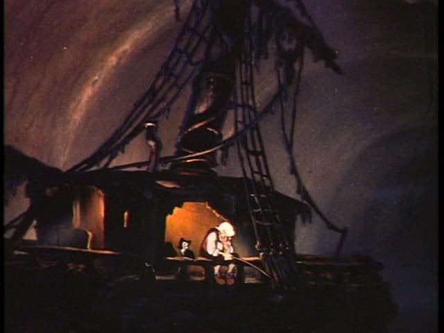
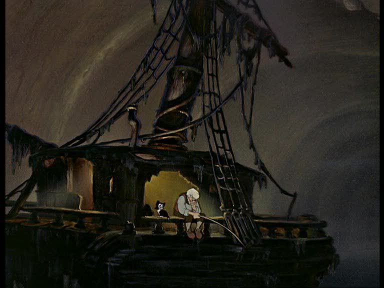
Look at the screenshot with Pinnocchio and the candle. In the first 2 screenshots there is an incredible atmosphere, warmth, a glow, a feeling.
That's what it's all about.
Now look at the 2003dvd screenshot. Some flat, plain, clear image with no atmosphere whatsoever. I can't even watch it. It's not just a matter of taste. The scene isn't working anymore. The candle looks fake. I don't believe the lighting anymore. The colour of the wall and the table don't match the lighting anymore. The scene is just ruined.
Just like the screenshot of Mowgli sitting on the ground I mentioned earlier. It just doesn't work anymore.
If you don't see that you just don't understand animation.
Last example;
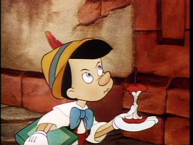
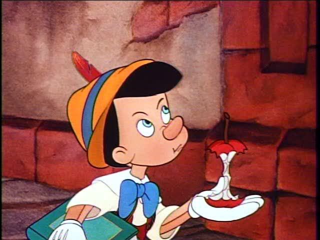
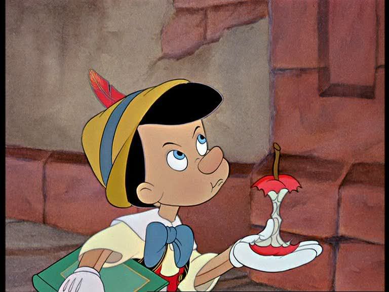
Take a look at the screenshot with the apple.
The look of the second one matches the rich look of a true Disney classic. The lighting and atmosphere, the way the patches are coloured in, the lines, the look.
The third screenshot matches the look of the sequels of the Little Mermaid (tv series)and Aladdin.
I've met some people who don't see the difference in animation between the (for example) Little Mermaid and Aladdin classics and the sequels, which I find astonishing.
-
Jordan
- Gold Classic Collection
- Posts: 413
- Joined: Thu Sep 25, 2003 11:15 am
- Location: DisneyLand Paris
I TOTALLY beg to differ!! I think you're mixing things up.Marky_198 wrote:Jordan wrote: The sequels are not too colorful, and shiny, and "over-bright".
They are just lacking atmosphere, it looks like evrything is coloured in with the computer, they look simple and childish. Just like the classics after the restorations.
Look at the screenshot with Pinnocchio and the candle. In the first 2 screenshots there is an incredible atmosphere, warmth, a glow, a feeling.
That's what it's all about.
Now look at the 2003dvd screenshot. Some flat, plain, clear image with no atmosphere whatsoever. I can't even watch it. It's not just a matter of taste. The scene isn't working anymore. The candle looks fake. I don't believe the lighting anymore. The colour of the wall and the table don't match the lighting anymore. The scene is just ruined.
Just like the screenshot of Mowgli sitting on the ground I mentioned earlier. It just doesn't work anymore.
If you don't see that you just don't understand animation.
Last example;
Take a look at the screenshot with the apple.
The look of the second one matches the rich look of a true Disney classic. The lighting and atmosphere, the way the patches are coloured in, the lines, the look.
The third screenshot matches the look of the sequels of the Little Mermaid (tv series)and Aladdin.
I've met some people who don't see the difference in animation between the (for example) Little Mermaid and Aladdin classics and the sequels, which I find astonishing.
What makes the difference between the original Aladdin and the sequels is NOT the brightness or anything that can be caused by a restoration, it's just plain bad drawing!! That's all!
And again, as That1GuyPictures pointed it out, you don't even know what you are refering to, to be able to say that the new restoration lost something from the original, because you didn't see it! How can you assume that the movie like you saw in formats like VHS or Laserdisc is the true and ultimate format?! How do you know it's not the other way round and that's with the new digital restoration that we are able to achieve what the drawings really looked like?!
As for the childish "effect" of the brightness, colors or whatever you think it is, (since you just said in was caused by colors generated by computers whereas you were saying earlier that it was not about colors, so I don't get you!), I think it looks way better now! For instance, look at these 2 screencaps made by drsd2kill; the first is the 2003 restoration and the second is the same frame "enhanced" by drsd2kill to his like and to what he thinks it should look like:


Ok now, c'mon seriously: you really think that the real one from the 2003 transfer look childish compared to the mock-up??! I would say it's the other way around! The colors are too bright, vivid and.... yes: childish, just like cheap sequels, posters aimed at kids or those ugly DVD cover arts Disney's been doing in the US.
I am European, and I know people in the US like brightness and vivid colors but still, don't you go and tell me that the second one of these pictures is better, doesn't look cheap and is setting an "atmosphere"!
Chandler (to Phoebe, over the phone) : Listen, Joey isn't gonna be here tonight so why don't you come over and I'll let you uh.. feel my bicep; or maybe more...
Friends, 5.14 - The One Where Everybody Finds Out
Friends, 5.14 - The One Where Everybody Finds Out
-
disneystarsfan

- Gold Classic Collection
- Posts: 187
- Joined: Wed Oct 04, 2006 2:04 am
- Location: Genie's Lamp
- Contact:
Whoa, Mister, I DID NOT make that second image. That was someone else on here who took it upon themselves to alter it.Jordan wrote:Marky_198 wrote:
Last edited by drsd2kill on Thu Oct 04, 2007 1:07 pm, edited 1 time in total.
Hmm, let's see here.... "In formats like VHS and Laserdisc"... I am not comparing the VHS releases since the resolution of the format is so low. Laserdisc is lower as well by about 80 lines, and it is an analog format, HOWEVER I think it is interesting to note that the 1993 Laserdisc WAS restored by photomechanical AND digital means. That same master was used for the 1999 DVD. Funny how all of a sudden it is "restored" again and looks completely different than it EVER has ANYWHERE.Jordan wrote:Marky_198 wrote:
Yes, maybe now we can finally see it "the way it was meant to be seen", as it was when it was ready to be photographed on the animation table.
Oh, but wait... We don't watch cels before they are photographed with flat lighting, do we?
I like the idea of using the newest digital tools to remove cel dust and scuffs as well as film-related dirt and damage. However, I think they have gone TOO far in trying to recreate these films in the digital realm, removing any trace that they originated on film.
I will be making new additional PINOCCHIO screen captures soon. I never liked the look of the 1985 or 1993 Laserdiscs - the former being too dim and dirty and the later overly bright and harsh-looking. But the 2003 DVD... Most of it I really like, but there are scenes that stick out and disappoint me in how flat they now look. In the bright, outdoor scenes this method of digital restoration works well, but in moody, intentionally dark and murkier scenes, well.... All atmosphere is lost.
BTW - I am making screen captures of DUMBO now, and BOY is that one movie that has been "restored" time after time, and each looks quite different!
-
disneystarsfan
- Gold Classic Collection
- Posts: 187
- Joined: Wed Oct 04, 2006 2:04 am
- Location: Genie's Lamp
- Contact:
drsd2kill wrote:
[/quote]Whoa, Mister, I DID NOT make that second image. That was someone else on here who took it upon them selves to alter it.[/quote]
thank you. Jordan obviuosly doesn't know who posted what and blamed you for it when you didn't do it. and sorry for those of you who don't like the pic that i re-did the color on. and just so all of you know, i didn't post that pic because i didn't like the 2003 Version. i just thought it could use some color that's all.
Disney Animation is the Best!
"you don't even know what you are refering to, to be able to say that the new restoration lost something from the original, because you didn't see it"
You are right, none of us really can, so let's be objective and watch the screenshots.
I can see that the 3rd screenshot of (for example) the candle scene looks ridiculous and isn't working at all. The candle looks fake, the atmosphere is gone. The glow on the wall and the table don't match the candle at all. It looks flat and empty.
All these things are perfect in the other screenshots, so let's just be objective and judge the screenshots.
I can't imagine the 2003 dvd was what they intended as we have other examples, earlier transfers of the same scene where those things look perfect.
I don't understand what you want to say with the screenshot with the candle that someone made brighter. It's not about the brightness in the first place, it's about removal of other things in the restorations. And the mocked up screenshot doesn't even exist. Yes, the 2003dvd screenshot looks awful in my opinion. But putting an even more afwul self-created screenshot next to it doesn't make the original 2003 screenshot less awful to me.
"As for the childish "effect" of the brightness, colors or whatever you think it is, (since you just said in was caused by colors generated by computers whereas you were saying earlier that it was not about colors, so I don't get you!)"
What I mean by that you can read in my previous posts. For example the one in this topic where I mention Baloo's belly. It's about atmosphere, details, lighter/darker shades, patches with different colours, lines, movie grain, way of photography of the original cells, lighting, the way a scene works etc.
And drsd2kill, I can't wait to see those Dumbo screenshots.
-
Jordan
- Gold Classic Collection
- Posts: 413
- Joined: Thu Sep 25, 2003 11:15 am
- Location: DisneyLand Paris
I'm sorry I got confused about who did the screenshot, I thought it came from drsd2kill, I read the other thread too fast. I apologize disneystarsfan. It was just to make a point, since you thought too that the 2003 restoration was bad and you offered a "correction" with your personnal screenshots.
drsd2kill: "I like the idea of using the newest digital tools to remove cel dust and scuffs as well as film-related dirt and damage. However, I think they have gone TOO far in trying to recreate these films in the digital realm, removing any trace that they originated on film."
I agree with you on that in somes cases (Cinderella), but definitely not on Pinnochio, which, I repeat, I think had a brillant restoration in 2003.
Marky_198, we disagree. I don't really see what atmosphere you're talking about here. I mean, lavishness in brightness and vivid colors doesn't create an atmosphere for me, it's more that just that, bu we don't have to share the same opinion
Looking at the Pinnochio screenshots makes me think of another film: Snow White. I think (at least I hope!!) that we can all agree that the film looked by far its best in the 2001 PE release. But take the previous restorations, the ones in 1987 and 1993 I think. It was a big mess! The colors were far too red-ish and vivid. It was even thought so by the people at Disney, as it's said on a featurette on the PE DVD. They admited they made a mistake. For me, it's the same for Pinnochio: those previous transfers make the film too red-ish in my opinon, which is the result of a bad transfer (made around the same time as the bad Snow White transfer al the more), and which was not intented to set a precedent to follow for future restorations. I don't see no atmosphere here, but maybe just a bad use of restoration technologies of the '80s, and, I think, got repaired with the new advancement in technology with the 2003 restoration (just like Snow White in 2001). It doesn't look cartoony at all, it just looks neat.
But now it's just MY opinion
But I think all that is also a matter of periods / eras and advancement in technologies and that triggers the tricky question of how to restore a film (especially animated) without altering too much with it. Do we keep its '40s, '50s "vivid" side or do we take advantage of today's technology in order to create something neat, without default. I think the right answer is a balance of both. But it's funy how looking at those screencaps you can tell what period the film transfer is from. It's the given source of that particular period, but does it mean it's the right one?... Things to ponder
Chandler (to Phoebe, over the phone) : Listen, Joey isn't gonna be here tonight so why don't you come over and I'll let you uh.. feel my bicep; or maybe more...
Friends, 5.14 - The One Where Everybody Finds Out
Friends, 5.14 - The One Where Everybody Finds Out