Posted: Wed Jun 11, 2008 10:43 am
DVDizzy Forum
Disney, DVD, and Beyond Forums
https://dvdizzy.com/forum/
Create your own PE DVD Cover art!
Page 29 of 34
Posted: Wed Jun 11, 2008 12:31 pm
I hope this answers everyone's questions - it's gonna be a BIG post...
I'll just use Off-Model Esmeralda as an example. So, here's the scanned drawing.

For the rest, I use a Wacom graphics tablet (http://wacom.com/index.html). Without one it would be impossible (for me, at least - also, there's probably a much more efficient, less time-wasting method than mine, but you asked, so here it is). I imported the scan of the sketch into Photoshop, then created a New Layer over the sketch. Using the Wacom tablet pen, I drew over the sketch with the Brush Tool to create the outline.

As you can see, I started by outlining Esmeralda's skin. Knowing that the skin outline would be different a different colour to the other outlines, I stopped and created another New Layer for the next outline colour, this time the hair.

I'll explain later why I create each outline on a new layer. Once the outline was finished...

...I removed the original sketch...

...and began to colour the picture using the Brush Tool. (Because the outlines are on different layers, I can't use the Paint Bucket Tool.)

In Photoshop I can automatically apply a certain colour to a whole layer, so creating all the outlines on different layers means that I can quickly change the colour of an outline to suit the main colour. This comes in handy if I change the main colour. If the outlines were all connected, I would have to separate the outline around the changed colour, which would involve tracing around it, cutting, etc. This way is just handier, and frees me up when it comes to choosing colours for everything. To change the colour of one of the outlines, go to the options at the top of the screen and click Layer > Layer Style > Color Overlay... From there you can change the colour of the layer. Once that was done...

...I began the shading by painting shadow around edges with a soft Brush Tool, then erasing any excess with a smaller, hard-edged Eraser Tool. I then did the highlights the same way.

So, em, that's it! I hope that explains everything properly. I've never written a tutorial before...
I'll just use Off-Model Esmeralda as an example. So, here's the scanned drawing.
For the rest, I use a Wacom graphics tablet (http://wacom.com/index.html). Without one it would be impossible (for me, at least - also, there's probably a much more efficient, less time-wasting method than mine, but you asked, so here it is). I imported the scan of the sketch into Photoshop, then created a New Layer over the sketch. Using the Wacom tablet pen, I drew over the sketch with the Brush Tool to create the outline.
As you can see, I started by outlining Esmeralda's skin. Knowing that the skin outline would be different a different colour to the other outlines, I stopped and created another New Layer for the next outline colour, this time the hair.
I'll explain later why I create each outline on a new layer. Once the outline was finished...
...I removed the original sketch...
...and began to colour the picture using the Brush Tool. (Because the outlines are on different layers, I can't use the Paint Bucket Tool.)
In Photoshop I can automatically apply a certain colour to a whole layer, so creating all the outlines on different layers means that I can quickly change the colour of an outline to suit the main colour. This comes in handy if I change the main colour. If the outlines were all connected, I would have to separate the outline around the changed colour, which would involve tracing around it, cutting, etc. This way is just handier, and frees me up when it comes to choosing colours for everything. To change the colour of one of the outlines, go to the options at the top of the screen and click Layer > Layer Style > Color Overlay... From there you can change the colour of the layer. Once that was done...
...I began the shading by painting shadow around edges with a soft Brush Tool, then erasing any excess with a smaller, hard-edged Eraser Tool. I then did the highlights the same way.
So, em, that's it! I hope that explains everything properly. I've never written a tutorial before...
Posted: Wed Jun 11, 2008 5:54 pm
Steve I truly appreciate your tutorial. I'm going to try it with my own graphic work. Thank you so much!
Posted: Wed Jun 11, 2008 8:57 pm
Call me late, but I just now found this thread.
These are covers Mollyzkobou made in some cover-making program, and we're most likely gonna use these for our fan-releases (of course, with actual info on the back... once they're finalized). Sorry for the small sizes, that's the max. resolution of the program.

Aladdin...

Beauty and the Beast...

The Little Mermaid...
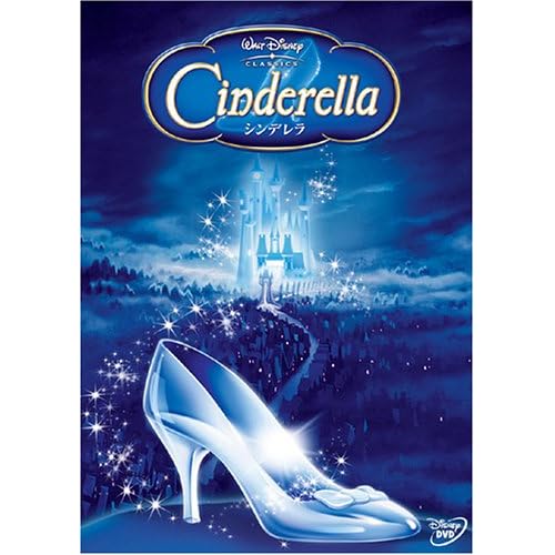
Basically these are the John Alvin posters made into an actual DVD cover. Another possible creation would use the Japanese promo-cover of Cinderella (here's a picture if you wanna see)
These are covers Mollyzkobou made in some cover-making program, and we're most likely gonna use these for our fan-releases (of course, with actual info on the back... once they're finalized). Sorry for the small sizes, that's the max. resolution of the program.
Aladdin...
Beauty and the Beast...
The Little Mermaid...
Basically these are the John Alvin posters made into an actual DVD cover. Another possible creation would use the Japanese promo-cover of Cinderella (here's a picture if you wanna see)
Posted: Wed Jun 11, 2008 8:59 pm
The software is Imandix, and I used it to throw together 3D images to show what the cover would look like on an actual case. I have slightly better copies here.
I'd recommend not saying too much about fan-releases. Call them "personal custom editions" or whatever.
I'd recommend not saying too much about fan-releases. Call them "personal custom editions" or whatever.
Posted: Thu Jun 12, 2008 7:25 am
looks great!
And thanks for the tutorial, Steve!
And thanks for the tutorial, Steve!
Posted: Thu Jun 12, 2008 8:07 am
I love the John Alvin posters. I wonder if anyone has high quality scans of them 
Posted: Thu Jun 12, 2008 11:34 am
Mollyzkoubou wrote:I'd recommend not saying too much about fan-releases. Call them "personal custom editions" or whatever.
What do you mean by this?
Posted: Thu Jun 12, 2008 11:57 am
Well...somewhere NOT on the internet, there is NOT a group of fans who are NOT restoring/re-doing Disney DVDs to NOT be the actual original theatrical versions (as opposed to the edited versions that are NOT on DVD). And they are NOT going to have a site that is NOT going to sell them.plinky wrote:Mollyzkoubou wrote:I'd recommend not saying too much about fan-releases. Call them "personal custom editions" or whatever.

What do you mean by this?
Albert
Posted: Thu Jun 12, 2008 10:58 pm
So I tried out your tips on a coloring book scan. here's what I came out with. I wanted to use it for my own cover but nothing seems to go with it. Figured posting it couldn't hurt.

Posted: Thu Jun 12, 2008 11:04 pm
^Wow, that'd make awesome disc-art Did you use a tablet like Steve did?
The texture on the Beasts fur looks a little odd with those shades though, but other than that, it's practically perfect! Very on-model.
The texture on the Beasts fur looks a little odd with those shades though, but other than that, it's practically perfect! Very on-model.
Posted: Fri Jun 13, 2008 10:32 am
nope just a regular old scanner then applied a gradient map to it to remove the excess and then I had a perfect black and white outline. And I went from there.
Posted: Sat Jun 14, 2008 8:03 pm
That's awesome work, steve!
I think Clopin and the Gargoyles should go on the empty left corner of the package, since they are also important figures in the story as well.
I think Clopin and the Gargoyles should go on the empty left corner of the package, since they are also important figures in the story as well.
Custom Covers for Disney DVDs
Posted: Sat Jun 14, 2008 8:45 pm
Pap64, try reading everything in the person's post you talk about. Steve already said he wanted to put the gargoyles in the empty right corner.
Steve, was your tutorial...the answer to my questions?
Well, Disney Villain, your picture impressed me and my eyes opened to take in the beauty and amazement. More people should be talking about it! However, I would like to see your tweaked version. Of course the fairies' colors need help, and generally everything should be colored more accurately and more uniformly. Like the bright candy-colored castle doesn't fit in with the darker, more movie-matching forest.
I would love to help you in your quest to fix the cover. That image you want clearer, I don't have it, but I agree it's better than the image we have on the current cover (and more like the movie's...well, Phillip's way off). So, I could actually try to re-draw the cover and then we could try to Photoshop color it in together! I have to aks my folks about setting up the scanner.
When you said the bottom "transforms" with the fairies, do you mean something like the fairies' magic (from the middle right of the cover) flows down to Aurora's dress and starts turning it pink, or something? With further explanation, I can try to draw something. I will work until you (and I) are satisfied (and if my scanner gets set up...my folks may not want to)!
Let me know if you are interested and I will pm you my E-mail address, or if you already remember it (it should be in your pm inbox) maybe you could E-mail me already.
Posted: Sun Jun 15, 2008 6:11 am
I'm no STEVE or Chernabog, but hey I hope you'll enjoy this
little something I whipped up a couple of hours ago...
It's an underrated picture that should have gotten a decent sequel and deserves a re-release anytime soon.

little something I whipped up a couple of hours ago...
It's an underrated picture that should have gotten a decent sequel and deserves a re-release anytime soon.
Posted: Sun Jun 15, 2008 11:32 am

Posted: Sun Jun 15, 2008 1:26 pm

Notice that I haven't finished the paw yet
Posted: Sun Jun 15, 2008 2:03 pm
The Great Mouse Detective cover looks great... and while I think it should have a 2-disc re-release, the existing release is great (except for someone telling me the colors were way too bright in a few scenes). I'd probably buy it as a PE, I agree that it's awesome.
The other two are good, but somehow I think The Rescuers Down Under text should be a little bigger, and higher in the picture. Oliver and Company looks good for a start, but what's with the all-new musical sequence? You're not supporting more Lion King releases, are you?
The other two are good, but somehow I think The Rescuers Down Under text should be a little bigger, and higher in the picture. Oliver and Company looks good for a start, but what's with the all-new musical sequence? You're not supporting more Lion King releases, are you?
Posted: Sun Jun 15, 2008 2:26 pm
NO, I just think these songs are great and I'd like to hear more!drfsupercenter wrote: You're not supporting more Lion King releases, are you?
Bette Middler, out of retirement and more singing!!!
As far as your comments go, you're right the text on RescDownUnd should've been bigger, but that perticular one took me the longest, I had to start from scratch, there are very very few images of this film!
In fact Joanna looks a bit blurry, that's because I took a photo from my TV-screen, turned out rather bogus I'm afraid
Oliver & Company, again no background images to work with, it's more of a starting point really
I'll be bringing more of these here, love your comments, I'll hope to improve my work along the way
In fact I'll bring in different versions for you to comment on!
An r-rated cut...

(coulden't decide in terms of colour scheme

A PG version for the kiddies is soon to follow
Posted: Sun Jun 15, 2008 2:34 pm
Do you know how to take screenshots?In fact Joanna looks a bit blurry, that's because I took a photo from my TV-screen, turned out rather bogus I'm afraid
I'm sure there are plenty of promo pics if you use Google Image Search... and those Black Cauldron covers look good, I just wouldn't buy it with that cover