Thanks, hope we get to see all those covers you could vote on DisneyBluLife!
Marce82, we disagree so much, lol. But by the way, in the Classics VHS, Maleficent is not opening her mouth. She's baring her teeth. She's seething with rage.
Aw, D82, it's nice you got to trade VHS's like that and watch Disney movies that way, but it's sad your Aladdin one got destroyed. But it's really great you got to find a rare one like that again! Thanks for liking my Cinderella VHS story! I'm glad you got to see Aurora's Platinum dress is indeed blue.
Comparing Home Releases Cover Arts
-
Disney Duster

- Ultimate Collector's Edition
- Posts: 14120
- Joined: Fri Jun 17, 2005 6:02 am
- Gender: Male
- Location: America
-
DisneyBluLife

- Gold Classic Collection
- Posts: 381
- Joined: Sun Oct 14, 2012 10:36 am
- Location: Sweden
Re: Comparing Home Releases Cover Arts
I will post those that I can find. The contests were held during 2012 so it was many years ago.
Re: Comparing Home Releases Cover Arts
Sorry, Disney Duster... I will have to disagree with you about Maleficent's mouth on the classics vhs... the farther edge of her mouth is too curved inward to have her baring her teeth. The teeth would be slightly blocking that edge of the mouth, and the line would be straighter.
Plus, i looked up a higher res version of it... you can kinda see her upper teeth a little near the top. If her teeth were gritting, then her bottom teeth would be insanely big. Kinda hard to explain.
Side note: looking at a higher res version, her nose is kinda big... still works. It's a good drawing.
And D82.... ha! Told ya! Glad you can see the mess (on the Masterpiece cover)
-
DisneyBluLife
- Gold Classic Collection
- Posts: 381
- Joined: Sun Oct 14, 2012 10:36 am
- Location: Sweden
Re: Comparing Home Releases Cover Arts
Swedish edition of the "Classic" VHS of Sleeping Beauty. Similiar artwork but it also has the Three good fairies on the cover.
http://osc.boavideo.com/product_info.ph ... s_id=30453
UK version.
http://www.videocollector.co.uk/sleepin ... 1959/17064
Fun fact:
The fairytale in Sweden is called "Törnrosa" which translates to "Briar rose". The term/name "Sleeping Beauty" is never mentioned in Swedish translations.
Swedish edition of the "Masterpiece" VHS. Here there is no border around the title. So clear blue sky with a castle in it.
https://www.videospace.fi/release/tornr ... sta_sweden
Similiar to the UK VHS cover, but here Philip's eyes are open. His eyes are closed on the UK VHS.
http://osc.boavideo.com/product_info.ph ... s_id=16429

Re: Comparing Home Releases Cover Arts
Nobody mentioned the mistake on the US Diamond Edition - the "S" in the title partially goes through Diablo's beak. It appears the UK edition was the original version because the title and his beak don't overlap.
I haven't posted my favorites since Dumbo lol. I'll get to it eventually, I just enjoy reading other people's opinions for now.
universALLove, great to see you back again!
I haven't posted my favorites since Dumbo lol. I'll get to it eventually, I just enjoy reading other people's opinions for now.
universALLove, great to see you back again!
-
JeanGreyForever

- Signature Collection
- Posts: 5335
- Joined: Sun Sep 15, 2013 5:29 pm
Re: Comparing Home Releases Cover Arts
I never noticed that the logo can be considered to resemble a shield. Nice catch there! I've sorta noticed The Black Cauldron parallels before and it makes sense since both films have a lot in common actually. One image I really love about the cover is how the dragon is wrapped around the castle, since we never see anything like that in the movie. I'd love to see imagery like that at the Disney Parks one day, with Maleficent as a dragon on top of one of the castles.D82 wrote: I not really a fan of the Mondo covers, but there are some things I like about that particular one, like how Maleficent's sleeves/cloak blend with the thorns, or that the logo forms the shape of a shield. The first thing I thought of when I saw that cover is the theatrical poster of The Black Cauldron bellow. Both have several things in common, like the hero holding a sword with the Princess next to him in the middle, that they're surrounded by a forest, and the villain looming over them.

I'm glad you like it. In Spain we many times get the same cover as the UK, but in this case we had a different one. I wonder if there are more countries that also got this cover. The purple coloring and the closeup of the castle are things I like about the cover too, as well as Maleficent's pose. Actually, that pose is not unique to the Spanish cover; it also appears in the UK VHS (you can check it below). If you notice, the three fairies also have the same poses there as well.JeanGreyForever wrote:Oh wow, that's absolutely stunning! Thank you for sharing that, because I've never seen it before. I like how different it looks from the rest of the covers even though it reuses the same kiss image. The purple coloring and the closeup of the castle makes for a nice change of scenery because it feels like we're actually looking into the castle rather than the usual faraway exterior shot. Also love how Maleficent is still looming above the background but for once, in a different pose. She looks positively batlike here.


You're right, it is the same Maleficent on both covers. She's way more prominent on the Spanish cover than the UK one though which is probably why I didn't notice her there. It's funny how they repurposed the fairies for the two covers as well.
Wow, I never noticed that before! I always thought those sleeves were weird but while it's one thing to include them on a poster in 1959, it's even stranger to bring them back for a new cover, albeit a contemporary one.Disney Duster wrote:Hey guys, I thought I'd also point out two things. The first preliminary cover with Aurora touching the spindle uses the same purpley pink dress with sleeve cusps as the original poster:
Thanks, JeanGreyForever, I never noticed that the second mock cover is like the original poster so much! Well I think I did notice it back in 2018, but I forgot. The green is definitely for the sky of the Forbidden Mountains.
That reminds me, I never shared my anecdote about how the reason I love the first Cinderella cover the best is because when I was three, I fell of a jungle gym and broke my arm, and to make me feel better my parents let me rent a movie, and it was that very cover that made me pick Cinderella and watch it and fall in love with it in the first place!

What a beautiful anecdote! I'm glad the cover led to you watching the film and cheered you up. It's always nice when something magical can come out of a terrible experience like that.
Cool, I knew that was the case for Aladdin but wasn't aware the same was true for Dalmatians and Aristocats. Can't wait to see those covers.DisneyBluLife wrote:When 101 Dalmatians, Aristocats and Aladdin came out on Blu-ray in France. People could vote for 3 different covers.
When it is time for those movies, we can post all the suggestions that they voted on.


We’re a dyad in the Force. Two that are one.
"I offered you my hand once. You wanted to take it." - Kylo Ren
"I did want to take your hand. Ben's hand." - Rey
-
Disney's Divinity

- Ultimate Collector's Edition
- Posts: 16380
- Joined: Thu Mar 17, 2005 9:26 am
- Gender: Male
Re: Comparing Home Releases Cover Arts
I typed up "Pocahontas cover France" and found the picture. Here it is. It's as beautiful as I remembered. Sorry, I know Pocahontas is way ahead, but since I'd already brought it up.D82 wrote: That Pocahontas cover you described sounds like a beautiful one, I also hope it gets posted when we get to that movie. 101 Dalmatians is one of my favorite Disney films too, and also The Jungle Book, which is one of the next movies as well.
This is probably my favorite version of the Classic artwork, even if I'm still not too fond of it. The fairies are nice and the colors look more vivid.DisneyBluLife wrote:Swedish edition of the "Classic" VHS of Sleeping Beauty. Similiar artwork but it also has the Three good fairies on the cover.
http://osc.boavideo.com/product_info.ph ... s_id=30453
I'm surprised it still looks good with the change in the castle. I know Aurora's head/face is way off (and she looks like a corpse), but I like the cover even though it's imperfect. The castle isn't exactly right either, just a generic castle. The fairies are drawn right, but not sized properly (Flora being the smallest even though she's the tallest and fattest). But I love the expression of Maleficent's face, Diablo, and the dragon scene. *shrug*Swedish edition of the "Masterpiece" VHS. Here there is no border around the title. So clear blue sky with a castle in it.
https://www.videospace.fi/release/tornr ... sta_sweden

Listening to most often lately:
Christina Aguilera ~ "Cruz"
Sombr ~ "homewrecker"
Megan Moroney ~ "Beautiful Things"

Re: Comparing Home Releases Cover Arts
How curious. It's also interesting that Philip's eyes are open in the Swedish cover and closed in the UK one, when the rest of the image is the same in both. Even though that cover wasn't used for any release in Spain, I had seen the Swedish version before in a magazine for kids I had as a child. It was a poster announcing the home video release. I prefer him with his eyes open. In the UK version it looks as if someone was taking a photo of them and the flash caused him to close his eyes.DisneyBluLife wrote:Fun fact:
The fairytale in Sweden is called "Törnrosa" which translates to "Briar rose". The term/name "Sleeping Beauty" is never mentioned in Swedish translations.
I hadn't noticed that. Maybe they had to move the title down a bit at the last minute to leave space for the Blu-ray logo, and they didn't notice the mistake or didn't have time to fix it.Mooky wrote:Nobody mentioned the mistake on the US Diamond Edition - the "S" in the title partially goes through Diablo's beak. It appears the UK edition was the original version because the title and his beak don't overlap.
You were right, it's a beautiful and quite unique cover. Thanks for sharing!Disney's Divinity wrote:I typed up "Pocahontas cover France" and found the picture. Here it is. It's as beautiful as I remembered. Sorry, I know Pocahontas is way ahead, but since I'd already brought it up.
-
Disney Duster
- Ultimate Collector's Edition
- Posts: 14120
- Joined: Fri Jun 17, 2005 6:02 am
- Gender: Male
- Location: America
Re: Comparing Home Releases Cover Arts
Marce82, I do not know about Maleficent's mouth. I looked again and I am just unsure now.
JeanGreyForever, thank you!
JeanGreyForever, thank you!


Re: Comparing Home Releases Cover Arts
This thread has been so active that I wonder if I should postpone 101 Dalmatians so that everyone could still talk about Sleeping Beauty and the previous films. What do you all think?
-
Disney Duster
- Ultimate Collector's Edition
- Posts: 14120
- Joined: Fri Jun 17, 2005 6:02 am
- Gender: Male
- Location: America
Re: Comparing Home Releases Cover Arts
My vote is yes, so that people can catch up. That is my personal thoughts on the matter.
-
JeanGreyForever
- Signature Collection
- Posts: 5335
- Joined: Sun Sep 15, 2013 5:29 pm
Re: Comparing Home Releases Cover Arts
I think you can go on ahead with 101 Dalmatians. All the new Sleeping Beauty covers have already been posted and discourse seems to be dying down, plus we already have precedent for people talking about past movie covers when we've moved onto another film. At most, maybe wait a few days if you feel the need to but I don't think waiting a whole week is necessary.
We’re a dyad in the Force. Two that are one.
"I offered you my hand once. You wanted to take it." - Kylo Ren
"I did want to take your hand. Ben's hand." - Rey
-
universALLove

- Collector's Edition
- Posts: 2401
- Joined: Fri Jul 08, 2005 8:21 am
Re: Comparing Home Releases Cover Arts
Agreed, I'd rather move on with the next. Each film has had a week, plus it'll be weeks before we get to later Classics if we extend certain films to 2 weeks.JeanGreyForever wrote:I think you can go on ahead with 101 Dalmatians. All the new Sleeping Beauty covers have already been posted and discourse seems to be dying down, plus we already have precedent for people talking about past movie covers when we've moved onto another film. At most, maybe wait a few days if you feel the need to but I don't think waiting a whole week is necessary.

Re: Comparing Home Releases Cover Arts
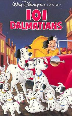
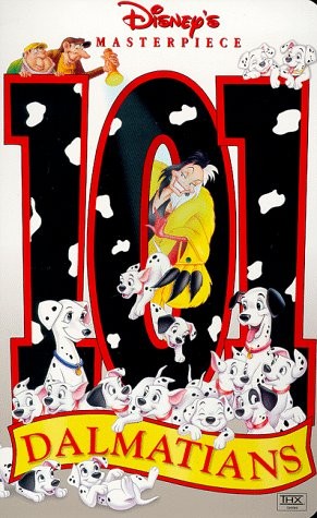
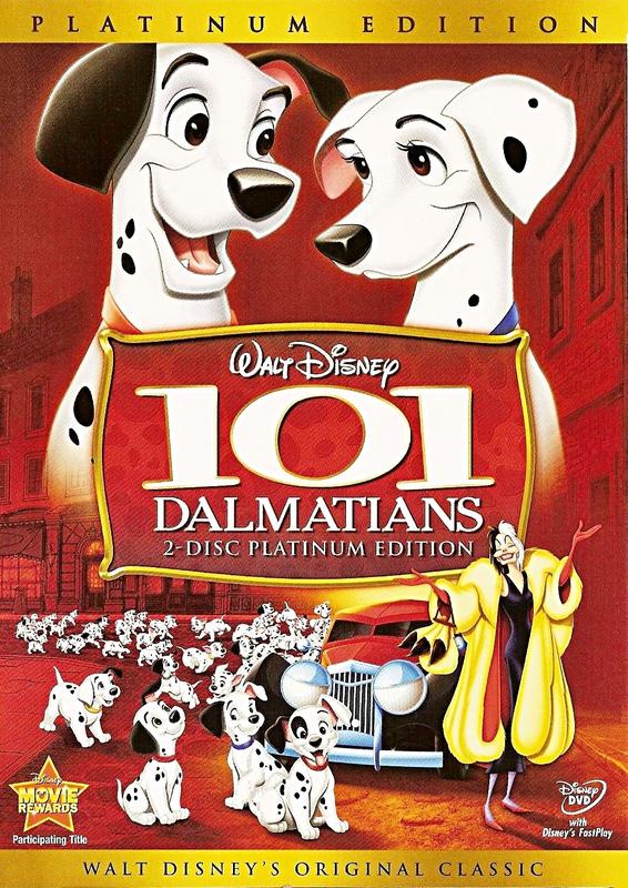
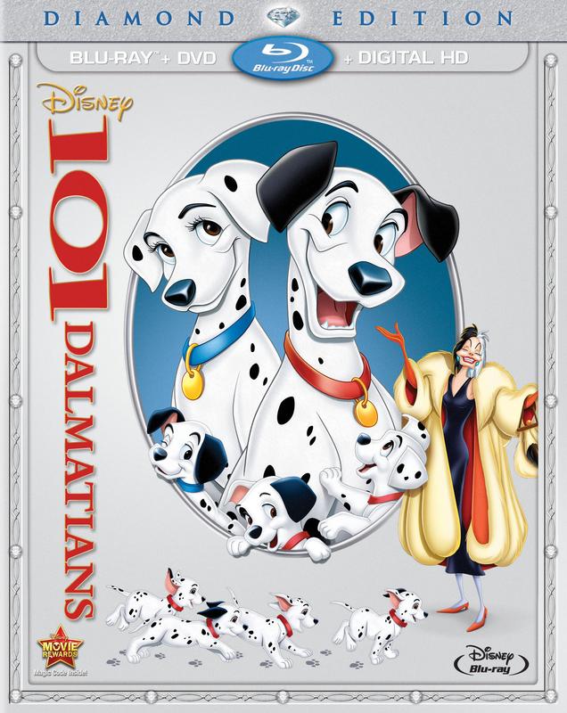
101 Dalmatians:
Classics VHS:
Masterpiece VHS:
Platinum Edition:
Diamond Edition:
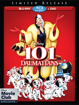
DMC Exclusive:
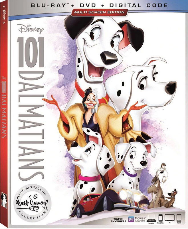
Signature Collection:
Best Buy:
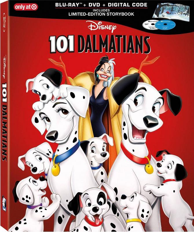
Target:
Classics VHS:
Masterpiece VHS:
Platinum Edition:
Diamond Edition:
DMC Exclusive:
Signature Collection:
Best Buy:
Target:
Re: Comparing Home Releases Cover Arts
Hey Disney Duster... I agree that M's mouth is a little unclear in that classics cover, which is part of the problem. That empty white space seems off (and gritted teeth is NOT an expression we ever see on Maleficent... she is a little too refined for that). I always felt it was more of an open mouth gasp... akin to her "It cannot BE!" moment before she flees the tower. But yes... up to interpretation.
Not sure if ANY movie has had as many covers as Sleeping Beauty...
Not sure if ANY movie has had as many covers as Sleeping Beauty...
Re: Comparing Home Releases Cover Arts
Here are some international covers for 101 Dalmatians.
UK and Spanish versions of the Classics VHS:


And UK Blu-ray from 2012:

I'll think about it, and share my favorites later.
UK and Spanish versions of the Classics VHS:
And UK Blu-ray from 2012:
I'll think about it, and share my favorites later.
-
DisneyBluLife
- Gold Classic Collection
- Posts: 381
- Joined: Sun Oct 14, 2012 10:36 am
- Location: Sweden
Re: Comparing Home Releases Cover Arts
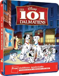
French Blu-ray cover art of 101 Dalmatians. The winner of the contest. Most people in France voted on this one. 
https://www.blu-ray.com/movies/101-Dalm ... ray/48685/
The second cover that people in France could vote on was the UK Blu-ray cover. But I can't seem to find the third cover right now unfortnately.
My favorites of 101 Dalmatians are:
1. UK Blu-ray (I love everything, the characters look great and the logo, I think they perfectly captured Pongo's and Perdita's personalities in the cover)
2. French Blu-ray (Great as the UK, and I really love Patch, I grew up with the this movie and the sequel "Patch's London adventure")
Fun fact: In Sweden Patch is called "Tuff", which translates to "tough". Because he is the toughest of the puppies.
3. Platinum edition DVD (Nice red and I like the faces of Pongo and Perdita )
4. Signature edition Blu-ray (Nice cover overall, especially compared to the lazy Sleeping Beauty) (But I don't like Cruella's crazy eyes here, way to scary)
5. Masterpiece VHS (Nice idea, brilliant with the having the characters together with the title. But the dogs are way to happy to see Cruella on the cover. And Cruella looks a little bit to happy too. The cover makes her look like their nice neigbour)
The rest of the covers are great too, but I don't feel anything special for them.
Last edited by DisneyBluLife on Sat Nov 23, 2019 11:16 pm, edited 2 times in total.
-
JeanGreyForever
- Signature Collection
- Posts: 5335
- Joined: Sun Sep 15, 2013 5:29 pm
Re: Comparing Home Releases Cover Arts
I always loved the Masterpiece VHS/Limited Edition DVD cover the most. I liked how it had Cruella coming out of the 0 in 101. Honestly, most of the covers have been pretty generic, featuring the inflated faces of Pongo and Perdita looming over a handful of puppies and some special spot for Cruella, so I haven't really been a fan of any of the DVD/Blu-Ray covers.
There's also this special packaging for the Platinum Edition in the UK. It reminds me of the Masterpiece VHS cover but with updated clipart so I'm quite a fan.

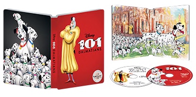
There's also this recent French steelbook cover which I like a lot as well. It keeps the characters in London without resorting to a blank red or white background.
There's also this special packaging for the Platinum Edition in the UK. It reminds me of the Masterpiece VHS cover but with updated clipart so I'm quite a fan.
There's also this recent French steelbook cover which I like a lot as well. It keeps the characters in London without resorting to a blank red or white background.
We’re a dyad in the Force. Two that are one.
"I offered you my hand once. You wanted to take it." - Kylo Ren
"I did want to take your hand. Ben's hand." - Rey
-
DisneyBluLife
- Gold Classic Collection
- Posts: 381
- Joined: Sun Oct 14, 2012 10:36 am
- Location: Sweden
Re: Comparing Home Releases Cover Arts
Oh, I love them too.JeanGreyForever wrote:I always loved the Masterpiece VHS/Limited Edition DVD cover the most. I liked how it had Cruella coming out of the 0 in 101. Honestly, most of the covers have been pretty generic, featuring the inflated faces of Pongo and Perdita looming over a handful of puppies and some special spot for Cruella, so I haven't really been a fan of any of the DVD/Blu-Ray covers.
There's also this special packaging for the Platinum Edition in the UK. It reminds me of the Masterpiece VHS cover but with updated clipart so I'm quite a fan.
There's also this recent French steelbook cover which I like a lot as well. It keeps the characters in London without resorting to a blank red or white background.
Re: Comparing Home Releases Cover Arts
Just a clarification first: I said that the VHS covers I posted were the versions of the Classics VHS for the UK and Spain, but I've looked their dates of release up and they came up in 1996 and 1995, respectively, while the US one is from 1992, so I guess they aren't part of the same collection. They are clearly inspired by the artwork from said edition though.
Maybe nostalgia plays a role in it, but my favorite is the Spanish VHS. It's not without its faults, but it's simple, the composition is not bad and it's an improvement over the Classics VHS in my opinion. Then, the Masterpiece Collection. That one is not the best drawn either, but I find it cool that the characters interact with the title. And my third favorite is the Diamond Edition, mainly because it's where Pongo and Perdita look best. They have the same poses in the UK Blu-ray and in the Target Edition, but I have bigger problems with those two covers.
The Target Edition would've been one of my favorites if not because of the placement of Cruella, which ruins the composition for me. The Best Buy is not bad either, but I think the Dalmatians should be in the cover too and not just Cruella. And I actually quite like the layout and the red-and-yellow theme of the Platinum Edition as well, but Pongo doesn't look too good in it to me and the puppies in the foreground are way too big compared to Cruella. The latter is a problem that also happens in the UK Blu-ray and it's too glaring for me to overlook.
In general, it seems getting the size of the puppies right wasn't easy for the artists, because they are either too small in relation to their parents (like in the Diamond Edition, the UK Blu-ray or in the UK Platinum JeanGreyForever posted) or two big (like in the Masterpiece Collection). It's also curious that Roger and Anita don't appear in any of the releases.
There isn't any cover that is very bad, but my least favorite one is probably the Signature Collection. The brushstrokes in the background make it look elegant and classy, but the choice of images for the collage is quite uninspired, and Perdita looks horrible there. Still, it's not a terrible cover either.
 As for the dogs, maybe they're not aware she's behind them. Either way, that's a problem I also have with several of the covers; that Cruella and the dogs look happy together and that doesn't represent the film either. The DMC Exclusive, for example, could've been one of my favorites too if not for that.
Maybe nostalgia plays a role in it, but my favorite is the Spanish VHS. It's not without its faults, but it's simple, the composition is not bad and it's an improvement over the Classics VHS in my opinion. Then, the Masterpiece Collection. That one is not the best drawn either, but I find it cool that the characters interact with the title. And my third favorite is the Diamond Edition, mainly because it's where Pongo and Perdita look best. They have the same poses in the UK Blu-ray and in the Target Edition, but I have bigger problems with those two covers.
The Target Edition would've been one of my favorites if not because of the placement of Cruella, which ruins the composition for me. The Best Buy is not bad either, but I think the Dalmatians should be in the cover too and not just Cruella. And I actually quite like the layout and the red-and-yellow theme of the Platinum Edition as well, but Pongo doesn't look too good in it to me and the puppies in the foreground are way too big compared to Cruella. The latter is a problem that also happens in the UK Blu-ray and it's too glaring for me to overlook.
In general, it seems getting the size of the puppies right wasn't easy for the artists, because they are either too small in relation to their parents (like in the Diamond Edition, the UK Blu-ray or in the UK Platinum JeanGreyForever posted) or two big (like in the Masterpiece Collection). It's also curious that Roger and Anita don't appear in any of the releases.
There isn't any cover that is very bad, but my least favorite one is probably the Signature Collection. The brushstrokes in the background make it look elegant and classy, but the choice of images for the collage is quite uninspired, and Perdita looks horrible there. Still, it's not a terrible cover either.
Thanks for sharing! It's not bad. Patch holding the title is cool, but in my opinion it doesn't represent the film too well because it looks as if he was the protagonist and that's not the case.DisneyBluLife wrote:French Blu-ray cover art of 101 Dalmatians. The winner of the contest. Most people in France voted on this one.
https://www.blu-ray.com/movies/101-Dalm ... ray/48685/
Maybe Cruella is happy because she's thinking about what she can do with the puppies.DisneyBluLife wrote:5. Masterpiece VHS (Nice idea, brilliant with the having the characters together with the title. But the dogs are way to happy to see Cruella on the cover. And Cruella looks a little bit to happy too. The cover makes her look like their nice neigbour)