Disney Custom Cover Sets
-
milojthatch

- Collector's Edition
- Posts: 2646
- Joined: Fri Jan 02, 2009 1:34 am
I have some new stuff to try out, but I'll do it later as I need a slight break from this. But, I'm kind of wanting to get rid of the black and lighten this thing up a bit, it just seems not very story bookish. But, I'll try a few things and see how it looks.
____________________________________________________________
All the adversity I've had in my life, all my troubles and obstacles, have strengthened me... You may not realize it when it happens, but a kick in the teeth may be the best thing in the world for you.
-Walt Disney
All the adversity I've had in my life, all my troubles and obstacles, have strengthened me... You may not realize it when it happens, but a kick in the teeth may be the best thing in the world for you.
-Walt Disney
-
DancingCrab
- Anniversary Edition
- Posts: 1030
- Joined: Mon Aug 23, 2010 3:20 pm
-
milojthatch
- Collector's Edition
- Posts: 2646
- Joined: Fri Jan 02, 2009 1:34 am
How is this?
I left the Mickey corners on the spine and back the old version so that a comparison between the new and the old would be easier. Past that, I altered the light parts inside the front and back (I still may get rid of them), I added the gold logos on the spin, made the spine more of a gray, and added some metallic filters to various spots. Thoughts?
I left the Mickey corners on the spine and back the old version so that a comparison between the new and the old would be easier. Past that, I altered the light parts inside the front and back (I still may get rid of them), I added the gold logos on the spin, made the spine more of a gray, and added some metallic filters to various spots. Thoughts?
____________________________________________________________
All the adversity I've had in my life, all my troubles and obstacles, have strengthened me... You may not realize it when it happens, but a kick in the teeth may be the best thing in the world for you.
-Walt Disney
All the adversity I've had in my life, all my troubles and obstacles, have strengthened me... You may not realize it when it happens, but a kick in the teeth may be the best thing in the world for you.
-Walt Disney
-
jpanimation

- Anniversary Edition
- Posts: 1841
- Joined: Mon Sep 07, 2009 12:00 am


-
Mickeyfan1990
- Collector's Edition
- Posts: 2559
- Joined: Sat May 05, 2007 12:24 pm
-
milojthatch
- Collector's Edition
- Posts: 2646
- Joined: Fri Jan 02, 2009 1:34 am
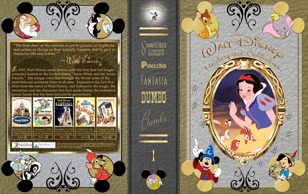
Ok, so for this post, I was in hopes of getting people's thoughts on the color of the inner boarder. I've heard a number of people say they weren't so big on the white being in the inside and one person suggested using the same gold color from the outside boarder and either making it darker or lighter then that. So, here is both version of that. Pay attention to the colors themselves, how it fits with the whole cover, and which one fits the best with which version of the corner "Mickey Heads." I've left both versions up still as I have not decided which one to go with yet. As for the title of the cover on the front, don't worry about it as much as I'm going to do something with it soon. Thanks!
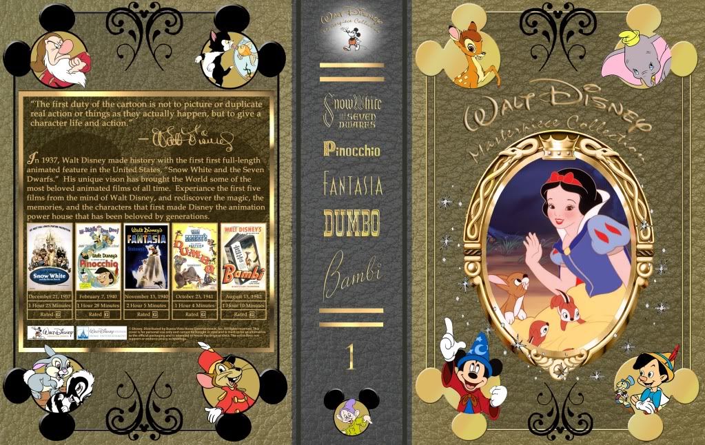
Dark
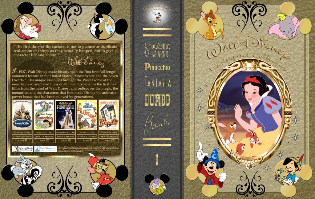
Light
Dark
Light
____________________________________________________________
All the adversity I've had in my life, all my troubles and obstacles, have strengthened me... You may not realize it when it happens, but a kick in the teeth may be the best thing in the world for you.
-Walt Disney
All the adversity I've had in my life, all my troubles and obstacles, have strengthened me... You may not realize it when it happens, but a kick in the teeth may be the best thing in the world for you.
-Walt Disney
-
Disney Duster

- Ultimate Collector's Edition
- Posts: 13369
- Joined: Fri Jun 17, 2005 6:02 am
- Gender: Male
- Location: America
-
milojthatch
- Collector's Edition
- Posts: 2646
- Joined: Fri Jan 02, 2009 1:34 am
Why thank you. I'm kind of liking the darker one, but, I've heard a lot of folks who like the lighter one elsewhere. I may keep both?Disney Duster wrote:I think the light version looks better, and more special. You just worked on this thing till it got better and better.
jpanimation if only that Rapunzel Blu-ray would be the real thing. Good job!
I agree by the way, the "Rapunzel" cover looks really good. I bet the real thing won't look as good.
____________________________________________________________
All the adversity I've had in my life, all my troubles and obstacles, have strengthened me... You may not realize it when it happens, but a kick in the teeth may be the best thing in the world for you.
-Walt Disney
All the adversity I've had in my life, all my troubles and obstacles, have strengthened me... You may not realize it when it happens, but a kick in the teeth may be the best thing in the world for you.
-Walt Disney
-
Will Barks

- Gold Classic Collection
- Posts: 138
- Joined: Thu Jul 03, 2008 8:09 am
- Location: Vienna, Austria
-
Disney Duster
- Ultimate Collector's Edition
- Posts: 13369
- Joined: Fri Jun 17, 2005 6:02 am
- Gender: Male
- Location: America
milojthatch, I actually liked the silver and gold one the best. I thought that was the most prestigious, special looking one.
Will Barks, your cover is very creative. Not my personal taste, but I must admire the strikingness of it.
As for the signature...Walt Disney's own real signature still looked a little bit like that, they just made it more perfect looking. I think it represents him more because Walt wasn't just about a mouse, everything he touched was at least unique, artful and kind of fancy, like his signature.
And then what about your signature in your banner, hm?!
-
Will Barks
- Gold Classic Collection
- Posts: 138
- Joined: Thu Jul 03, 2008 8:09 am
- Location: Vienna, Austria
-
milojthatch
- Collector's Edition
- Posts: 2646
- Joined: Fri Jan 02, 2009 1:34 am
Silver and Gold? Do you mean when I had the titles on the spine in silver?Disney Duster wrote:milojthatch, I actually liked the silver and gold one the best. I thought that was the most prestigious, special looking one.
Will Barks, your cover is very creative. Not my personal taste, but I must admire the strikingness of it.
As for the signature...Walt Disney's own real signature still looked a little bit like that, they just made it more perfect looking. I think it represents him more because Walt wasn't just about a mouse, everything he touched was at least unique, artful and kind of fancy, like his signature.
And then what about your signature in your banner, hm?!
____________________________________________________________
All the adversity I've had in my life, all my troubles and obstacles, have strengthened me... You may not realize it when it happens, but a kick in the teeth may be the best thing in the world for you.
-Walt Disney
All the adversity I've had in my life, all my troubles and obstacles, have strengthened me... You may not realize it when it happens, but a kick in the teeth may be the best thing in the world for you.
-Walt Disney
-
milojthatch
- Collector's Edition
- Posts: 2646
- Joined: Fri Jan 02, 2009 1:34 am
Ok, so there was some questions about color it seems. So, I've made a few different versions and I'd like some feed back as to which one looks best. There is:
Version One:

Version Two:

Version Three:

Version Four:

Just let me know which one looks best, I'm open to keeping ore then one version, but kind of wanted blue for the Pixar covers, but nothing is written in stone.
Version One:
Version Two:
Version Three:
Version Four:
Just let me know which one looks best, I'm open to keeping ore then one version, but kind of wanted blue for the Pixar covers, but nothing is written in stone.
____________________________________________________________
All the adversity I've had in my life, all my troubles and obstacles, have strengthened me... You may not realize it when it happens, but a kick in the teeth may be the best thing in the world for you.
-Walt Disney
All the adversity I've had in my life, all my troubles and obstacles, have strengthened me... You may not realize it when it happens, but a kick in the teeth may be the best thing in the world for you.
-Walt Disney
-
Mickeyfan1990
- Collector's Edition
- Posts: 2559
- Joined: Sat May 05, 2007 12:24 pm
-
Disney Duster
- Ultimate Collector's Edition
- Posts: 13369
- Joined: Fri Jun 17, 2005 6:02 am
- Gender: Male
- Location: America
I thought this one looked silver and gold:
It also reminds me of the book that opens Snow White.
As for the latest ones, I honestly like them all, but I would say number 3 is the one that I think looks the most prestigious. It looks like a book, just like how the first two of those films open.
I think blue or red could go either way for Disney or Pixar, but if you ask me, Disney has always been blue, blue, blue. Blu represents goodness in their films, a lot of characters wear blue. And I always think of the blue sky with stars shining in it when I think of Disney.
But in Pixar, you have The Incredibles and Cars and Toy Story...and I think I think red. Or even green. I guess blue and yellow are very Pixar with the Luxo Jr. ball and Toy Story.
You could do a purpely blue for Disney and a greenish blue for Pixar. Well, whatever you do I'm sure it'll look great, as it already has!
One more comment: I don't know if it's possible to make the Disney dust, the white stars and sparkles, to look more real. I can see their outlines. Is there a way to make them look more like they do in the films, or just not have the outlines? Oh, and it should probably stay white. They only had gold Disney dust in Peter Pan, with the pixie dust.
I like that one because not only does it look the most special, but I think those colors fit with the kinds of colors found in those films. Walt just used more muted colors like that in his early films.milojthatch wrote:
It also reminds me of the book that opens Snow White.
As for the latest ones, I honestly like them all, but I would say number 3 is the one that I think looks the most prestigious. It looks like a book, just like how the first two of those films open.
I think blue or red could go either way for Disney or Pixar, but if you ask me, Disney has always been blue, blue, blue. Blu represents goodness in their films, a lot of characters wear blue. And I always think of the blue sky with stars shining in it when I think of Disney.
But in Pixar, you have The Incredibles and Cars and Toy Story...and I think I think red. Or even green. I guess blue and yellow are very Pixar with the Luxo Jr. ball and Toy Story.
You could do a purpely blue for Disney and a greenish blue for Pixar. Well, whatever you do I'm sure it'll look great, as it already has!
One more comment: I don't know if it's possible to make the Disney dust, the white stars and sparkles, to look more real. I can see their outlines. Is there a way to make them look more like they do in the films, or just not have the outlines? Oh, and it should probably stay white. They only had gold Disney dust in Peter Pan, with the pixie dust.

-
Hogi Bear

- Special Edition
- Posts: 606
- Joined: Mon Mar 14, 2005 12:36 am
- Location: New Zealand - Population: 60+ Million Sheep Origin: Unknown
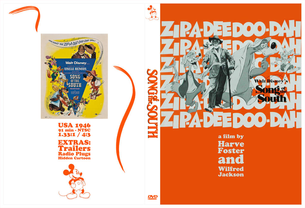
This is a cover I made because the cover for Region 4 set is made of cardboard and if you were to open the case vertically the discs would fall out. So it wasn't really made for fan covers, so I hope it's fine posting it here  . I haven't printed it yet, because I'm debating whether I can be bothered enlarging the Title (WALL-E - I forgot to make it a separate layer) and whether or not the lamp post looks right on there. I've been considering removing it.
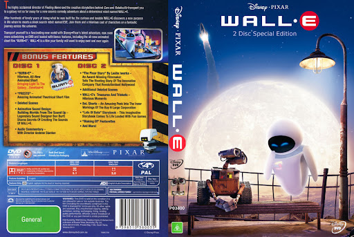
The back is a scan of the original cover, with sides filled in where the half circles for pulling the DVD tray out were. The front is from a French Theatrical poster. I had to remove all the French and I also had to move title WALL-E to the top.
Edit: High Resolution:
http://picasaweb.google.com/lh/photo/XQ ... directlink the image on the page is 16.6 MB
Last edited by Hogi Bear on Mon Dec 13, 2010 9:55 pm, edited 1 time in total.
No signature needed - Kyoto Animation put out some beautiful animation
-
milojthatch
- Collector's Edition
- Posts: 2646
- Joined: Fri Jan 02, 2009 1:34 am
Thanks everyone! Some great comments, and it seems what I can tell is each one of them is liked by someone, but there is yet to be a cover that everyone likes. It is that way with the custom DVD cover forum I'm on as well. I'm thinking of going with maybe 3 different covers, the one's with the goldish/ brown outer edge, but with the white/ gray, maroon, and royal nave blue centers. I kind of favor those three and seem to get more response to one of those three. That said, I hope that I can finally start on volume two soon, which I hope is not as long to make. Thanks!
@ Disney Duster: Thanks for your kind words. I like that one you pointed out the best as well, but also like the maroon one (number 3). I'm think right now that I may make both the Disney Animated Classics and Pixar the three same colors and then let whoever likes them choice witch version they like best. But, then again, I may make Pixar a tear sort of color. Green is defiantly being saved for the "Disney Nature/ True Life Adventures" covers. Keep in mind though that the colors for the DAC covers will be the same for the old ones and the new ones.
@ Hogi Bear: I really like your cover! If I was going with just individual covers, I'd may want to use yours. It looks great!
____________________________________________________________
All the adversity I've had in my life, all my troubles and obstacles, have strengthened me... You may not realize it when it happens, but a kick in the teeth may be the best thing in the world for you.
-Walt Disney
All the adversity I've had in my life, all my troubles and obstacles, have strengthened me... You may not realize it when it happens, but a kick in the teeth may be the best thing in the world for you.
-Walt Disney
-
Hogi Bear
- Special Edition
- Posts: 606
- Joined: Mon Mar 14, 2005 12:36 am
- Location: New Zealand - Population: 60+ Million Sheep Origin: Unknown
Thanks milojthatch. Your covers look great by the way. You have a nice design going on there. Might also look nice printed on a leathery vinyl or fabric, but that might be a bit expensive I guess.
The cover I did, the hardest part was removing all the poster wording, but other than that I'm not sure I added that much to it. It still took a bit of time though.
It's cool though how everybody is making these and it leaves you thinking Disney should browse through these threads for their covers (and pay the lucky person ), because there are quite a few cool designs around here.
The cover I did, the hardest part was removing all the poster wording, but other than that I'm not sure I added that much to it. It still took a bit of time though.
It's cool though how everybody is making these and it leaves you thinking Disney should browse through these threads for their covers (and pay the lucky person
No signature needed - Kyoto Animation put out some beautiful animation
-
Hogi Bear
- Special Edition
- Posts: 606
- Joined: Mon Mar 14, 2005 12:36 am
- Location: New Zealand - Population: 60+ Million Sheep Origin: Unknown
@milojthatch By the way I forgot to add I think your fully Blue one (DisneyVolOneWIP002-1.jpg) and leathery brown one (DisneyVolOneWIP003-1.jpg) look the best (to me anyway), they have that classic look and would look really cool on custom made cases.
It's also cool how you put little Mickey heads in the centre top and bottom art pieces. You have an eye for detail.
It's also cool how you put little Mickey heads in the centre top and bottom art pieces. You have an eye for detail.
No signature needed - Kyoto Animation put out some beautiful animation